
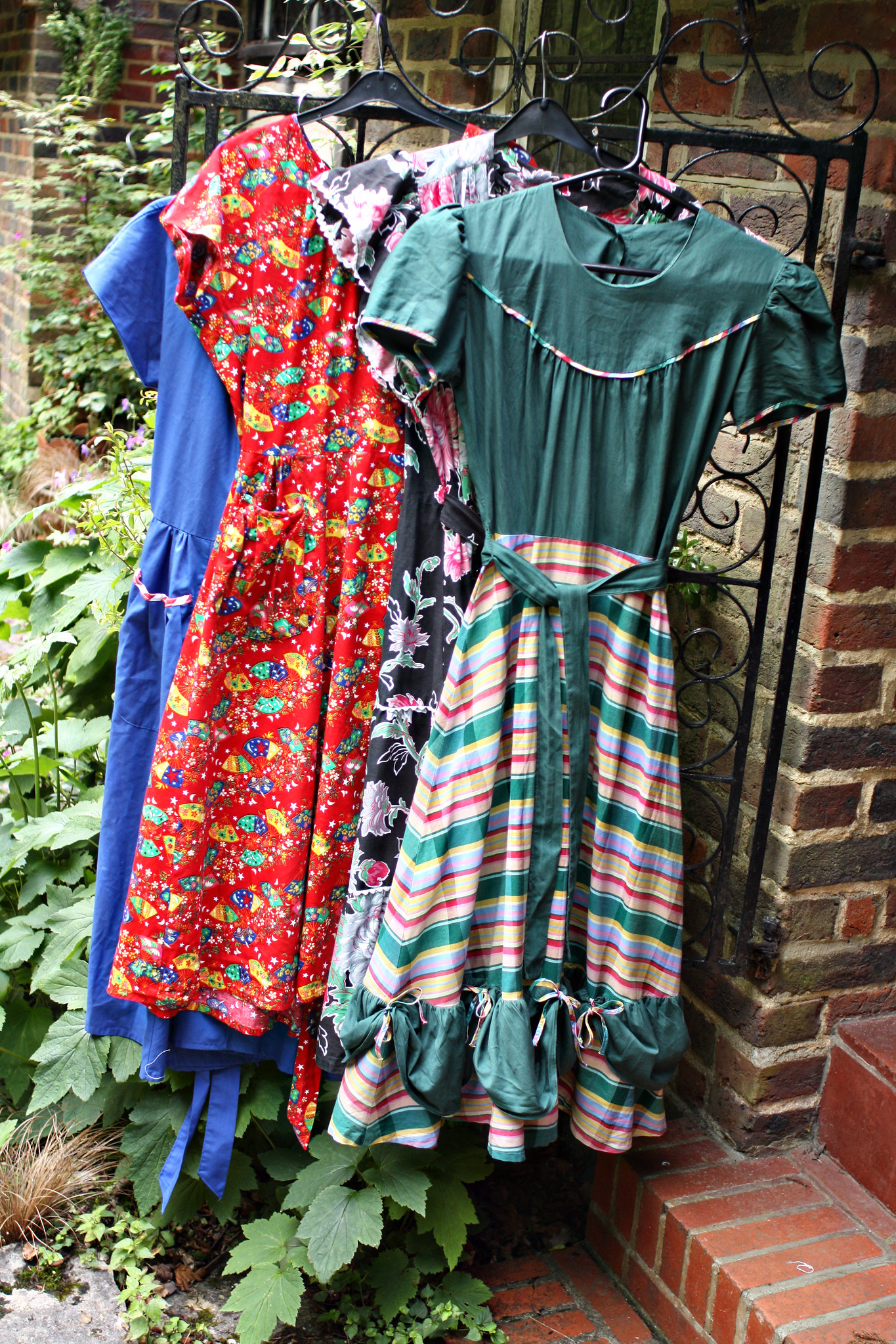
Do excuse the very unstylish hangers... and the fringe isn't back - I took these a while ago!
Colour is a very important thing when it comes to clothing. I've written about it here before, because it's probably even more relevant to vintage as it is to modern fashion. Back in the 40s and 50s, designers (and the people wearing the garments) were so much braver about colour, which many don't realise due to the fact photos are so often in black and white. In reality, ladies fashion was a riot of colour - you only need to look at vintage feedsack fabric and pattern packets to see. Every few years a modern magazine or label will extol the virtues of 'colour blocking' (or, wearing two bright contrasting shades together) like it's a brand new phenomenon. But really it's just because it's long been the norm in mainstream style to pair a bright colour with a dark or neutral one to avoid looking 'over the top'. I'm even guilty of it myself sometimes (though not often. More is more, after all).
Being brave with shades and bold with my style choices is not something I've ever struggled with personally; from my grungy teenage years to my vintaged twenties and thirties, I've never shied away from pairing coral and turquoise together, yellow and blue or emerald green and fuchsia. I've also never not bought a vintage dress because I wasn't sure if the colour suited me. Unless it was beige – I'm a bit of a beigist. But dark brown, mustard tones or grey – all these muted shades have a place, albeit dressed up with a brighter tone elsewhere in the outfit. I've never been afraid of colour, or of wearing certain shades.
Therefore, while having my 'colours done' was something I had chatted about with a good friend, who'd herself had an assessment a number of years before, it wasn't something I had ever considered doing myself. Not seriously enough to actually take the plunge, anyway. So, when said friend gave me a surprise birthday voucher for a consultation of my own with a company called Colour Me Beautiful, I was very intrigued and went along with an open mind (despite my vow to still wear colours that apparently 'don't suit me' if they're part of my beloved wardrobe).
The lady who was my most local Colour Me Beautiful consultant is called Anita Feron Clark (she has her own style consultancy as well), and she was herself very well dressed, as well as perfectly coiffed and made up, which of course helps. I arrived makeup free, and after a bit of a chat to work out why I was there (I think most people buy these consultations for themselves as they honestly have no clue) she sat me in a chair and draped me in white for a completely neutral start.
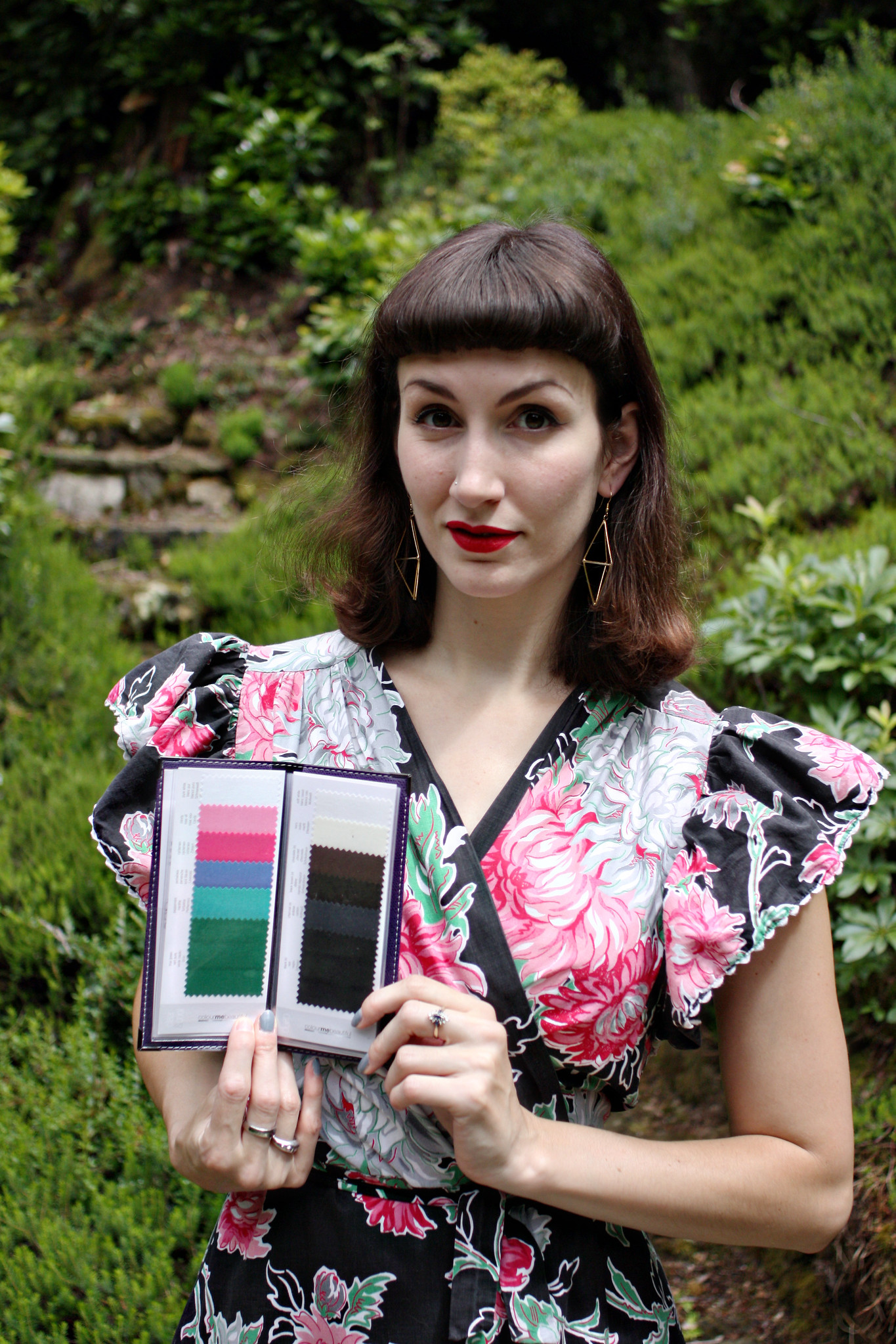
We quickly establish that my dark hair, dark eyes, and pale skin makes me someone with 'Deep and Cool' colouring. I'm told I should be wearing jewel tones, lots of greens, blues, purples and blue-based reds/pinks. I shouldn't be wearing pastel tones next to my face without something darker to offset it, like a cardigan in navy or charcoal grey. I watched Anita place swatches of different coloured cloth under my face as she showed me my ideal shades, and I nodded knowingly whilst not really being able to tell the difference. Well, that's not strictly true - it's obvious when shades really suited me, but less obvious that the paler ones didn't... if that makes any sense. After we finished the colour profiling, she put a little bit of makeup on me, just so I could see some shades that I perhaps wouldn't wear myself. She didn't do a hard sell, for which I was grateful, though the makeup was lovely and seemed good value. But I'm definitely happy with my current slap supply!
All in all, it was a great experience and very interesting to anyone who, like me, is a bit of a colour matching (and general style) fanatic. It's not really made me vow to ditch any of my paler coloured garments, but I have made a conscious decision to try and pair them with darker colours.
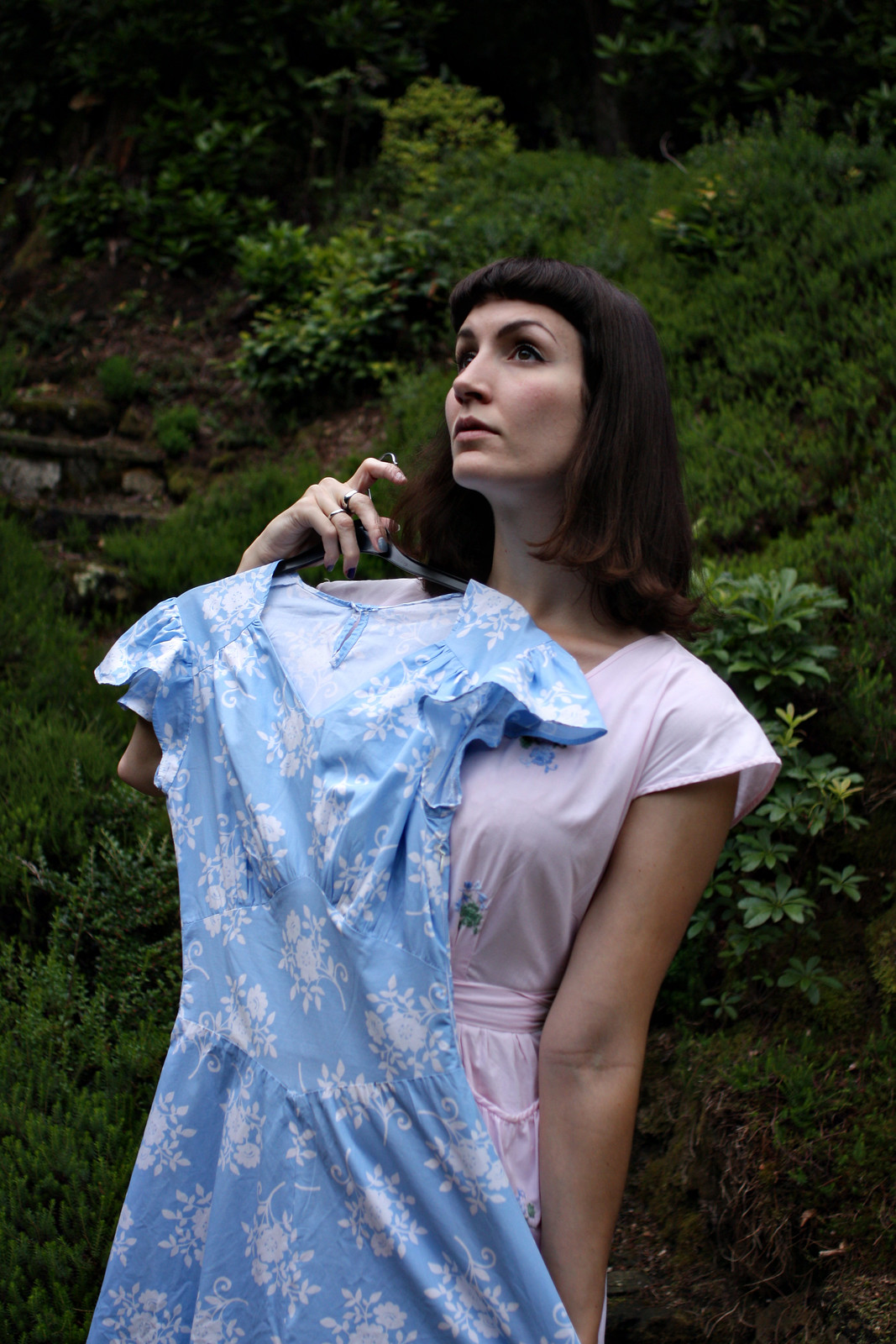
However, pictures are worth a thousand words and, as a result of this and after looking through the colour swatch booklet I received, I did decide to conduct a photographic experience to let you, dear readers, be the judges. Actually, it was just an excuse to get out some of the frocks I hadn't yet been able to wear over the summer.
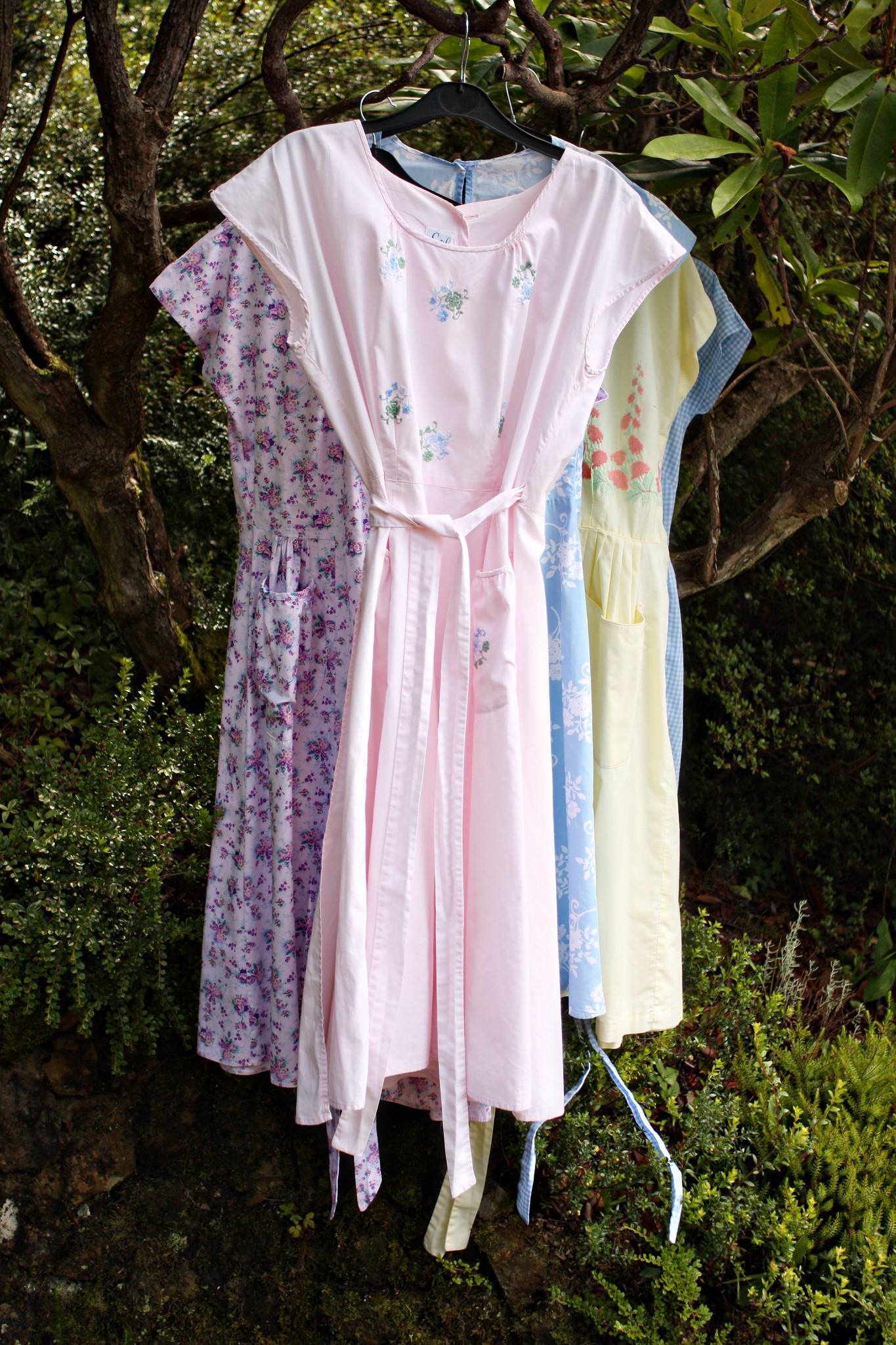
These frocks are apparently all a no-no for my colouring, so it's a shame I own so many of them!
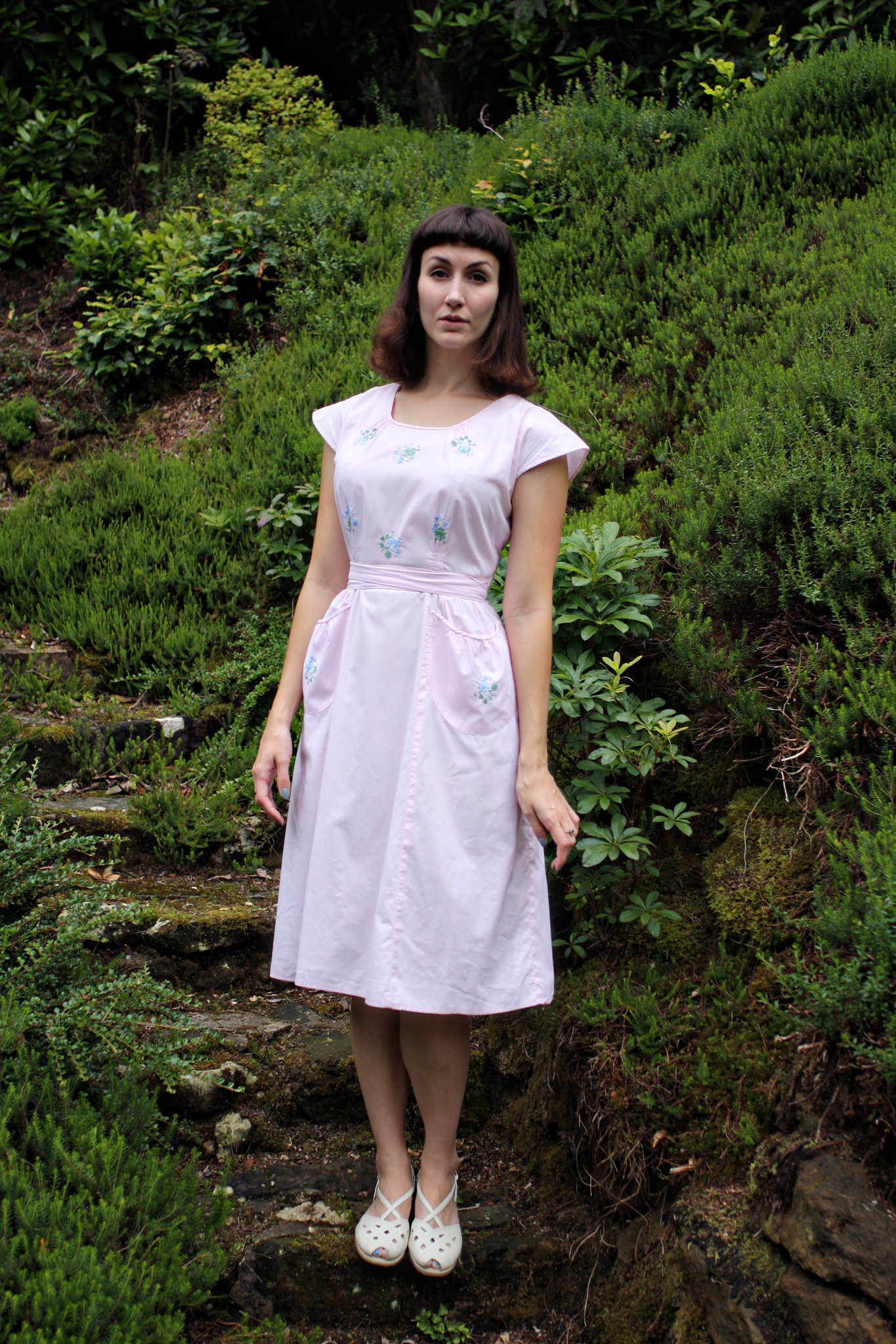
I concede that these shades do make me look a little pale... but hopefully interesting?
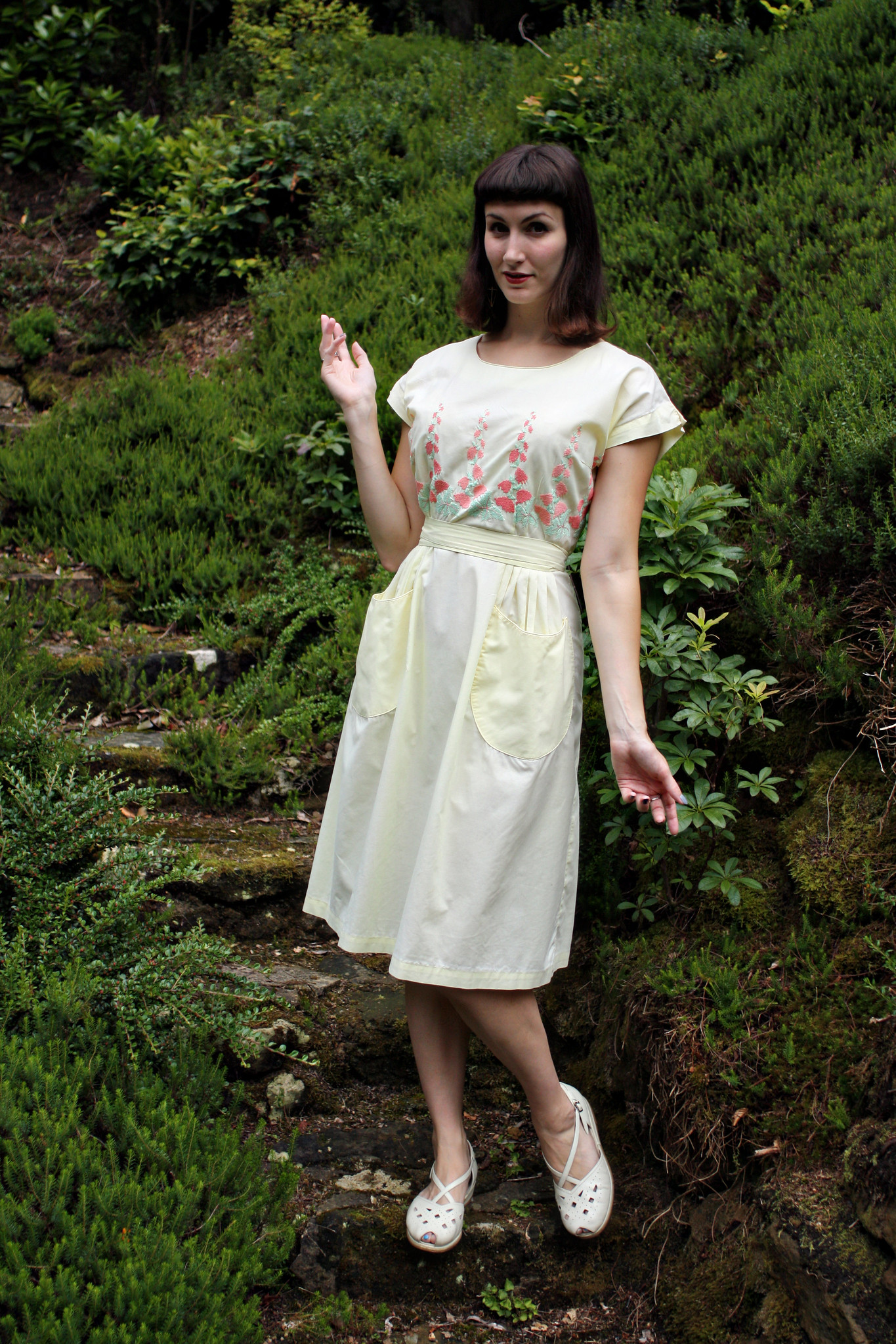
It might be that it's the lack of lipstick. This is a pastel yellow dress that shouldn't suit me. I still wear it!
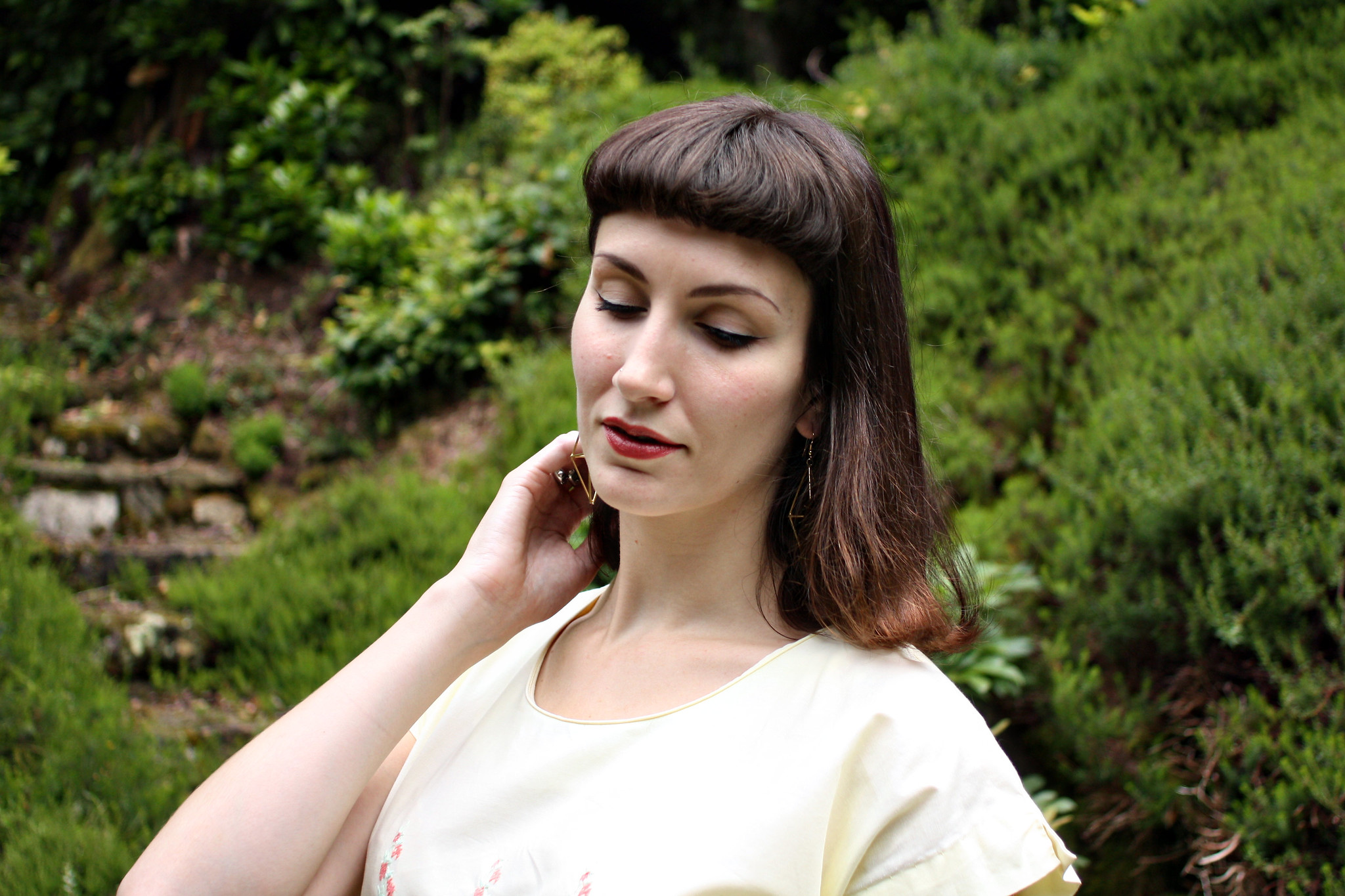
This lipstick that's also 'wrong' as it's not a shade that's meant to flatter me, and it's also a little pale (it looks more subtle in real life, I have to say).
What do you think? Personally, I think I can just about pull it off, though it's probably fair to say that these pale frocks don't grab the eye as much as some of the stronger coloured and patterned ones I own. So let's look at some of those.
Is darker really better?
These dresses are the ones that should technically suit me best, and perhaps they do. The evidence follows...
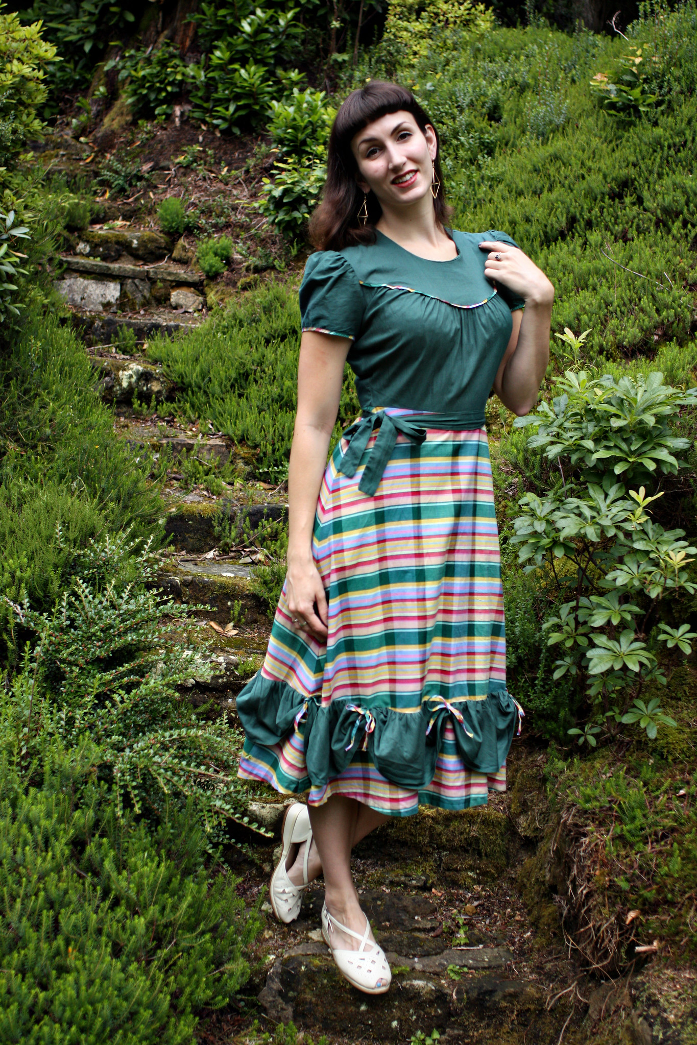
A dark forest green (not forgetting the rainbow stripe/plaid/whatever it is trim) western inspired dress from the 1940s ticks all the right boxes for me. Plus it looks much more striking. So there may be something in this after all. But with pale lipstick, it's still not quite right to my eyes!
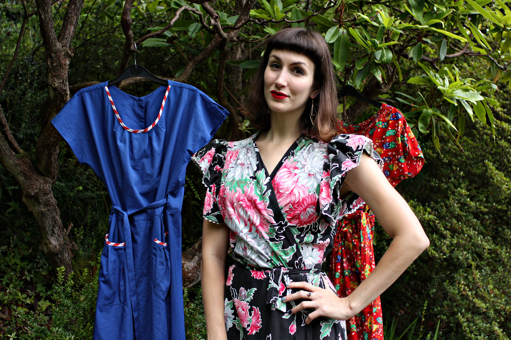
This is the jackpot according to my colour consultation. The 'right' dress and the 'right' lipstick. It's an all-time absolute favourite of mine, despite being technically a house dress. It's even more of a dressing gown than a dress - wrap front and with a tie. But the pattern! Look at its amazingness!
It probably helps that this favourite dress of mine has all the colours that apparently suit me best! I've been subconsciously doing this right for years. ;)
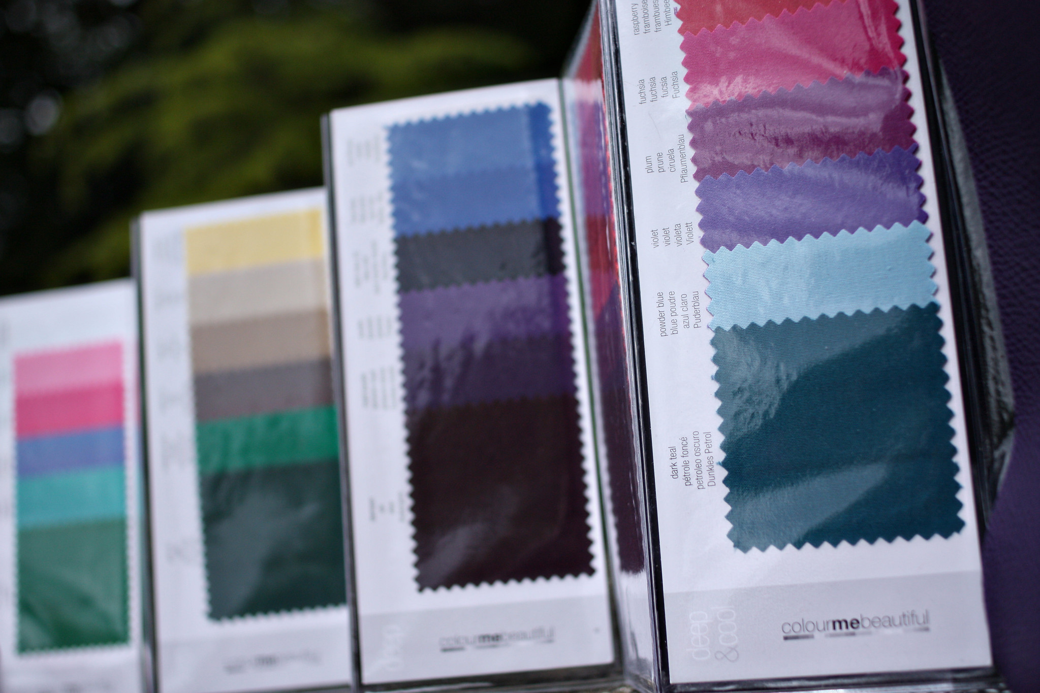
And finally... this is the colour swatch booklet that came with my consultation. If you're coloured similarly to me, here are your best colours! They are the ones I gravitate towards, naturally.
If anyone would be interested, I'll do a post summing up the different 'types' and what is meant to suit each, so do let me know if you'd like to read something along those lines!
And until next time, have a lovely week.
Fleur xx
DiaryofaVintageGirl.com


0 comments:
Post a Comment